This is an initial idea we came up with as a group for our DigiPak. The use of Rubik's cube represents the youth and unity of sub- cultures indicated by the different colours which also emphasises the pop punk genre. The pop punk genre are usually associated with young music that incorporates social issues in a form of performance using band members and loud music. The front cover is quite simple and to the point which is effective as it reflects the group itself and the simplicity in their music. The band name is exaggerated more on the cover as it more recognisable and so will be easily identified by fans of this particular band. The album name is 'Enigma' which means mystery and suspense. This again provides a outlook for the album as it makes it increases curiosity for the fans.
 The in side of the DigiPak would also be a continuation of the front cover using the Rubik s cube as this will provide a consistent design throughout the digipak. The benefits of having cubes within the design allows us to put pictures of band members within the squares. Each cube would represent a different individual within the band. Along with images we have also come up with the idea of using lyrics over the Rubik's cube. This necessarily does not mean we are going to include all the lyrics from all the songs from the album We may only use lyrics from the most popular track that we have created a music video for, The Death wish.
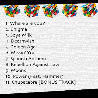
The back cover is also kept very simple hear. Keeping the Rubik's cube in the design, the back cover has the name of all the songs in the album. The songs are written on white which compliments well with the rest of the digipak. The Rubik's cubes are floating above the back cover in different angles which align with the ongoing theme, The innovative names of the other songs within the album stick to the mood of the genre. They are realistic names of songs that could possibly be used in an album of pop punk.


No comments:
Post a Comment