Thursday, 28 February 2013
Layout of Website
Home Page: which is also a landing page. This is primarily a page taken up by an image of the band with hyper links below and the above the page which direct you to the inside information of the website.
Music Page: This contains the current music of the album and their upcoming new album. It also has a discography of the previous work arranged chronologically with their album covers.
Photo Page: This is page dedicated for the fans which contains a number of various random images of the band members in their everyday lives and behind the scenes rehearsals. This enables the audience to be more close with the stars as they get an insight of the stars' of screen life styles.
Video Page: The video page includes extra videos of individual artists. This promotes their talent and ability in their work. This page is not only for the music videos within albums but also for special features and other relevant videos with the band.
Band Page: This page is dedicated to the band members It has biographies for each band member which informs the audience a little bit about them.The layout of this page is quite simple and self explanatory where you click the images in order to find out more about them. This again enables the audience and fans to relate to the stars as it gives an overview of the attitude in real life
Tour Page: The tour page provide the details of the upcoming tours. The information are easily accessible and self explanatory.
Rejected Idea
This was our initial idea for our front cover of our digipak. The idea behind it was having different forms of music technologies over the past years in each polaroid and arranging them in the sense so that it looks like a pinboard. We wanted to keep this theme consistent throughout the digipak including the inside. This was essentially a good idea as it was innovative and new however we decided to reject it at the end as it lacked potential scope and we wanted to have large images of the band members too. Therefore we decided to discard this particular idea and go forward with the Rubiks cube.
Wednesday, 20 February 2013
DigiPak Design Idea
This is an initial idea we came up with as a group for our DigiPak. The use of Rubik's cube represents the youth and unity of sub- cultures indicated by the different colours which also emphasises the pop punk genre. The pop punk genre are usually associated with young music that incorporates social issues in a form of performance using band members and loud music. The front cover is quite simple and to the point which is effective as it reflects the group itself and the simplicity in their music. The band name is exaggerated more on the cover as it more recognisable and so will be easily identified by fans of this particular band. The album name is 'Enigma' which means mystery and suspense. This again provides a outlook for the album as it makes it increases curiosity for the fans.
 The in side of the DigiPak would also be a continuation of the front cover using the Rubik s cube as this will provide a consistent design throughout the digipak. The benefits of having cubes within the design allows us to put pictures of band members within the squares. Each cube would represent a different individual within the band. Along with images we have also come up with the idea of using lyrics over the Rubik's cube. This necessarily does not mean we are going to include all the lyrics from all the songs from the album We may only use lyrics from the most popular track that we have created a music video for, The Death wish.
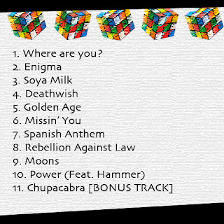
The back cover is also kept very simple hear. Keeping the Rubik's cube in the design, the back cover has the name of all the songs in the album. The songs are written on white which compliments well with the rest of the digipak. The Rubik's cubes are floating above the back cover in different angles which align with the ongoing theme, The innovative names of the other songs within the album stick to the mood of the genre. They are realistic names of songs that could possibly be used in an album of pop punk.
Subscribe to:
Comments (Atom)


